Onboarding project | Slice
" Nothing says 'trust us with your money' like a fuzzy eyeball and an eyeball with wings! Who knew banking could feel like a trip down Alice’s rabbit hole? " - Boomer Soul trapped in a Millennial

What?.... I.JUST.HAD.TO! This is not a roast (yet) I promise, but lets quickly look at Slice's Core Value Proposition before getting into the target customer profiles and their respective pain points that translate to JTBDs.
Leverage is what sets the affluent apart, and Slice brings this advantage to the digitally savvy youth - Transparent, Hassle-Free, and devoid of gotchas.
Designed for Zillennials stepping into financial independence, Slice offers simplified access to credit, cashback, and rewards, breaking down traditional barriers to financial products. Focused on being the go-to solution for this generation, Slice redefines money management, making spending more flexible, rewarding, and accessible.
Promises
✅ UPI First Account - sub 1 minute account creation ; fast, secure, ad-free
✅ Borrow your way - flexible line of credit ; that aids building-up credit history and thereby credit scores
✅ Rewards made fun - win fire(platform currency) through payments and referrals, also cashbacks
Building a strong financial foundation with Slice

Slice equips its users with financial tools to take control of their money.
Credit Score feature helps track and improve credit health
Autopay automates recurring payments to avoid late fees, and
Spend Analytics that provides insights into spending habits for smarter financial decisions
Betting on the fact that India’s young generation now drives significant consumption across categories - from OTT platforms and food delivery to digital services - Slice steps in with a financial product designed for this digital-first lifestyle.
In the founder's words circa 2019 - "Our addressable market size is 60 Mn youngsters, gig workers, freelancers, small business owners, startup employees, and graduate students, who are not using financial products like credit cards because either they don’t understand them or they don’t have easy access."
Segueing into ICPs

Broadly, all of the 15M of Slice's customers fit the following boxes
- 18-29 years (Average Age - 22yrs)
- Students, early-career Professionals, Freelancers, Young Entrepreneurs
User Behaviours and Willingness to Pay
Weekly feature usage for different customer segments (ICPs) on a scale of 1 to 5, where 1 indicates low usage and 5 indicates high usage.
 *the stacked bar represents the overall usage frequency.
*the length of each segment in the stacked bar reflects the relative importance or frequency of that feature’s usage within the total usage frequency for that ICP, effectively a weighted split of total usage.
- Young Entrepreneurs and Early-Career Professionals have high engagement with Low-Fee Credit Access and Interest-Free Installments, suggesting a strong need for accessible credit options.
- Digital Dwellers frequently use Expense Tracking and Reward-Driven Spending, indicating a focus on budgeting and rewards.
- Freelancers prioritize Flexible Credit and Interest-Free Installments, highlighting their need for financial flexibility.
- College Goers show lower engagement overall, with moderate interest in Interest-Free Installments and Willingness to Spend, indicating cautious financial behavior.
Slice's ICP prioritization based on usage frequency and willingness to spend would lead to picking Early-Career Professionals and Digital Dweller.
Early-Career Professional
Usage Frequency at 4 (on a scale of 1-5)
Willingness to Spend at 3, but will improve as this ICP grows financially
Digital Dweller
Usage Frequency of 5 (on a scale of 1-5)
High Willingness to Spend at 4 given strong online spending habits
And thus, the onboarding experience should largely focus on the JTBD's for these ICPs in addition to communicating clearly the product's core value proposition.
Note : During my deep dive on Quora, I started noticing a pattern: post after post that seemed to scream ‘Dear Freelancer, Slice is for you!’ Looks like they were going all-in on the freelance charm offensive!
A quick look at key motivations by ICPs

A visual summary of user calls and secondary research

By ICPs

A typical user journey starts on Slice's webpage

Done Well
- Tagline Placement: "Feel easy with money" is positioned prominently, giving a relaxed, approachable vibe right at the start.
- Friendly Typography: The playful font for "money" aligns well with the brand's tone, creating an informal and accessible feel for users.
- Clear, Focused Message: The text emphasizes a straightforward value proposition — "Create your account in 1 min" — which instantly conveys the ease of onboarding.
- Value Oriented Messaging: Points like “Fast, secure, and ad-free” address common user concerns, adding trust and clarity to the message.
- Detailed Use Case Display: The focus on the borrowing feature is clear, and elements like the repayment slider make the functionality feel accessible and user-centric.
- Personalization Emphasis: Phrasing like "Set your repayment plans" makes the experience feel customizable, which could appeal to users looking for flexible borrowing options.
Could be better
- Visual Relevance: The floating decorative elements (e.g., wings and plant-like decorations) don’t add much value and feel disconnected from the product’s core message. They might distract users from the CTA and key messaging.
Replace with visuals that reinforce the product’s financial benefits or create a simpler, less cluttered background.
- CTA Emphasis: The "download slice now" button lacks prominence, which could lead users to overlook it.
Increase the contrast, size, or animation of the CTA to make it a focal point.
- CTA Consistency: While the message is focused, ensuring CTA placement and design consistency across screens would help users easily follow the journey.
Ensure the CTA button style is uniform across all screens to reinforce familiarity and usability.
- Emphasize Key Interactives: The slider and borrowing limit are critical interactive features but could be easily missed due to competing visual elements.
Use a high-contrast background or shadowing to make these interactive components pop and feel more intuitive.
- Visual Hierarchy: Establishing a clearer visual hierarchy here could help guide users' attention to the most important information, like the borrowing amount and CTA.
Minimize surrounding visuals or use layout techniques to guide users’ eyes naturally to core information.
- Reduce Visual Clutter: While the visuals are less distracting than the top screen, some decorations still divert attention.
Keep visual elements minimal or align them with the brand message to improve focus.
A quick pitstop at the App Store

Done Well
- Consistent Value-Driven Messaging: Each screen provides a clear feature or benefit, maintaining a strong focus on what Slice offers to improve the user’s financial experience.
- Visually Engaging: The use of vibrant backgrounds and device-centric visuals captures attention and aligns with a modern, tech-savvy brand image.
Could be better
- Avoiding Overpromise Across Screens: Certain phrases, like "just a tap" and "win cashback instantly," could create expectations that may lead to disappointment if they aren’t fully accurate.
Ensure each screen is transparent by adding disclaimers or rephrasing to set realistic expectations without losing appeal.
- Accessibility and Visual Contrast: The vibrant backgrounds, while eye-catching, may reduce readability for some users and could benefit from higher contrast for accessibility.
Test contrast levels and consider slightly toned-down backgrounds or increased text contrast for better readability.
But before hitting download, check the ratings and reviews, one does

Done Well
- Strong Rating: A 4.2-star rating with 28K+ reviews builds trust and suggests general user satisfaction.
Could be better
- Recency Bias in Reviews: Recent negative reviews on fees impact perception.
Address these in replies and highlight improvements.
Lest it leads the prospect down an even more dangerous path of Cognitive Dissonance.
Misalignment between Slice's web presence and the app experience can create cognitive dissonance for users who expect a seamless, fee-free, or highly flexible borrowing experience based on initial marketing. When they encounter reviews or experiences that contradict this perception—like high charges or borrowing limits—it can cause an internal conflict, potentially leading to mistrust or even user churn.

- Proactively Address Common Complaints: Recurrent issues with fees and limits affect retention.
Regularly update the app with fixes and address user concerns in release notes.
For instance, add information in the app about factors affecting borrowing limits and eligibility, so users have a clearer understanding upfront. A notification about eligibility or periodic limit adjustments can help set the right expectations.
- Align Messaging Across Platforms: Ensure that Slice’s website, app store, and in-app experience consistently communicate any fees, limits, or eligibility conditions.
- Transparent Marketing: Highlight both benefits and limitations clearly, so users have realistic expectations from the start.
- In-App Education: Use onboarding and tooltips to proactively address common concerns, helping to bridge any perception gaps early on.
When the hook’s that good, who’s really paying attention to the haters? Amiright?

Done Well
- Simplicity : The use of Slice's signature purple color and simple design reinforces brand identity right from the start.
Could be better
- Changing Taglines: The tagline "The simplest way to pay" appears inconsistently, potentially creating uncertainty about Slice’s core value proposition.
Keep the tagline consistent across all screens to strengthen the brand’s message and reduce user confusion.
- Permission Request Timing: The notification permission prompt appears abruptly without context, which might feel intrusive.
Briefly explain the value of notifications (e.g., "Get real-time updates on payments and rewards") before the prompt to increase opt-in rates.
The Sign-Up Flow


In-App Setup

Done Well
- Clear Iconography: The icons on the explore page are straightforward, making it easy for users to identify core features (e.g., rewards, bill payments).
Could be better
- Balance Screen as Primary Landing: Showing the ₹0 balance initially might feel underwhelming and lacks immediate value, especially if the user has not set up an account.
Start with a more engaging screen, like the explore page, which showcases various features and benefits.
- Welcome Message and Guided Tour: There’s no personalized welcome or onboarding to guide new users through the app’s primary functions, potentially leading to confusion.
Add a brief guided tour or tooltips to highlight key functionalities (e.g., rewards, bill payments) and encourage exploration.
This one is against the ethos of Slice which believes it doesn't need to handhold its users through the navigation
To which I say - its why "Skip Now" exists.
Some core actions could use a little nudge. Intuitive? Sure. Instantly obvious? Not quite. We'll agree to disagree on this one for now.


Done Well
- Clear Borrowing Limits: The “Slice Borrow” screen effectively highlights key information such as loan amount, interest rates, and flexible EMI options, giving users a clear understanding of what to expect.
- Simple Profile Layout: The profile page has a clean, easy-to-navigate design, with important sections like "Invite & earn" and "Action Center" displayed prominently.
Could be better
- Enhance the "Action Center" with Core Functions: The Action Center could include a starter checklist. (e.g. balance check, activate upi account, first transaction) .
Showcase is a progress bar to initial setup completion.
- Clarify Borrow Activation Process: Users may be unsure about what happens after they tap "Activate" on the borrowing screen.
Provide a brief description below the "Activate" button, like "Begin verification to unlock your borrowing limit," to set clear expectations.
Much of aimless meandering later....

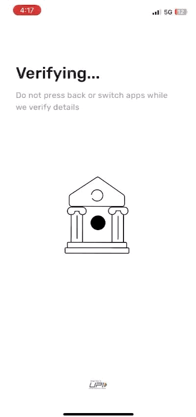
Are we ready for the magic, yet?

 *This was more of a
head-scratcher than an AHA!
Some priming could've helped this case. I would add a message in the prior screen as to what they are verifying my information against.

Account Setup under a minute ? - HECK YES!
What's better is the seamless account linking experience in which a user simply has to select the bank and the account number and details get pulled up automatically as long as your account is linked to the registered phone number. (still kicking myself for not capturing this bit!)
The Activation Nudge

Note : They've not explicitly classified you into any of their user personas so far.
Lets look at a user behaviour flow that captures a natural progression from initial interest to full, active usage, with each step reinforcing user commitment and preparing them for long-term engagement with Slice.

This leads us to 4 key activation metrics
Hypothesis 1 : Activate UPI within 5 minutes of completing registration
- Activating UPI within this timeframe suggests that users understand the app’s value and are motivated to use it as their primary payment method.
- Relevance : Quick activation also indicates a smooth, intuitive onboarding experience, where users easily grasp the value Slice offers. Tracking this metric can reveal any friction in the activation process, helping improve user conversion.
Hypothesis 2 : Add funds to account within 24 hours of app installation
- Adding funds is a commitment action that indicates trust in Slice’s security and usability. Completing this step within 24 hours reflects users’ confidence in the app.
- Relevance : A high percentage of users adding funds in this timeframe implies trust and utility, while a lower rate may point to a need for clearer messaging around security and fund usage benefits.
Hypothesis 3 : Activate card within 10 minutes of adding money to the Slice UPI account
- Activating the Slice card shortly after adding funds shows immediate intent to engage with the payment functionalities.
- Quick card activation implies that users are ready to utilize Slice as a primary payment option, indicating seamless onboarding and effective communication of the card’s benefits.
- Relevance : Tracking this metric helps identify any friction in the activation journey and assess user readiness for full product usage.
Hypothesis 4 : Link phone number within 5 minutes of adding money
- Explanation: Linking a phone number immediately after adding funds is crucial for secure transactions, especially with UPI.
- Completing this step promptly shows user trust and commitment, suggesting that the onboarding process effectively communicates the importance of security.
- Relevance : Lower linkage rates might reveal areas for improved messaging around security benefits.
Relevant Metrics
UPI Activation Rate to measure efficiency of the onboarding flow and immediate user engagement with the core payment feature.
Calculation : The percentage of total users who complete UPI activation within the first 5 minutes after registering on Slice.
Account Funding Rate to assess user trust in Slice’s financial services and commitment to using the app’s core features.
Calculation: The percentage of users who add funds to their Slice account within 24 hours of app installation.
Card Activation Rate to assess user intent to make Slice a primary payment method and evaluate the effectiveness of guiding users through essential setup steps.
Calculation: The percentage of users who activate their Slice card within 10 minutes of adding funds.
Phone Linkage Rate to demonstrate user trust and readiness for secure transactions, showing confidence in fully setting up their account.
Calculation: The percentage of users who link their phone number within 5 minutes of adding funds to their Slice account.
Retention Rates (D1, D7, D30) to understand long-term engagement and the success of Slice’s onboarding in establishing sustained usage.
Calculation: The percentage of users who return to the app on Day 1, Day 7, and Day 30 after completing key actions (e.g., UPI activation, fund addition)
Note : because majority of the churn occurs within 9 days of app download, use time-based cohort analysis, grouping users into cohorts based on their onboarding time
References :
https://brandequity.economictimes.indiatimes.com/files/cp/1139/cdoc-1658399014-Fintech_Retention_Guide.pdfBrand focused courses
Great brands aren't built on clicks. They're built on trust. Craft narratives that resonate, campaigns that stand out, and brands that last.


All courses
Master every lever of growth — from acquisition to retention, data to events. Pick a course, go deep, and apply it to your business right away.


Explore courses by GrowthX
Built by Leaders From Amazon, CRED, Zepto, Hindustan Unilever, Flipkart, paytm & more
Course
Advanced Growth Strategy
Core principles to distribution, user onboarding, retention & monetisation.
58 modules
21 hours
Course
Go to Market
Learn to implement lean, balanced & all out GTM strategies while getting stakeholder buy-in.
17 modules
1 hour
Course
Brand Led Growth
Design your brand wedge & implement it across every customer touchpoint.
15 modules
2 hours
Course
Event Led Growth
Design an end to end strategy to create events that drive revenue growth.
48 modules
1 hour
Course
Growth Model Design
Learn how to break down your North Star metric into actionable input levers and prioritise them.
9 modules
1 hour
Course
Building Growth Teams
Learn how to design your team blueprint, attract, hire & retain great talent
24 modules
1 hour
Course
Data Led Growth
Learn the science of RCA & experimentation design to drive real revenue impact.
12 modules
2 hours
Course
Email marketing
Learn how to set up email as a channel and build the 0 → 1 strategy for email marketing
12 modules
1 hour
Course
Partnership Led Growth
Design product integrations & channel partnerships to drive revenue impact.
27 modules
1 hour
Course
Tech for Growth
Learn to ship better products with engineering & take informed trade-offs.
14 modules
2 hours
Crack a new job or a promotion with ELEVATE
Designed for mid-senior & leadership roles across growth, product, marketing, strategy & business


Learning Resources
Browse 500+ case studies, articles & resources the learning resources that you won't find on the internet.

Patience—you’re about to be impressed.